20 May 2014

Potato Prints


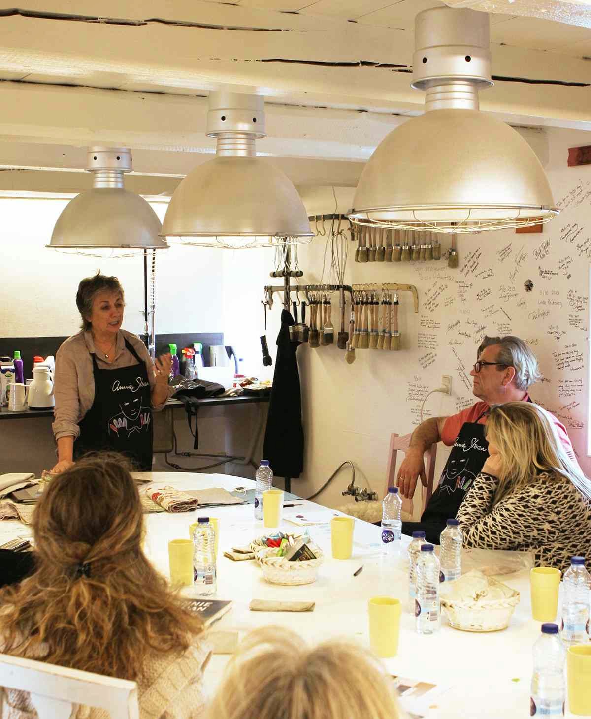
I love potato printing as a technique because anybody can cut shapes as I did on this cabinet (above). 

You don’t have to be able to draw, and I find that empowering – and isn’t that what my paint and products are all about? I’m much more interested in seeking people’s creativity especially those who feel or think they can’t draw – but in fact anyone can achieve a finish like this.

I printed this old cabinet a very long time ago – and it was old and shabby when I bought it in the mid 1990s! But I like the results: the top drawer has been worn away through constant family use and it’s been in each house we’ve owned for keeping gloves, keys, all sorts of things. So it has a sentimental value too.


Wonky work out

I did a rough concept of what I want to achieve but nothing exact – it’s all rather wonky but that’s its charm. I was aiming for a parallel design but something organic and fairly loose – not uniformly designed, and anyway that just won’t happen with this technique.

With potato (or carrot or cork, other good printing ‘tools’) you need to create some simple shapes– you can’t do anything very fussy because it ends up looking silly. These particular motifs turned into something African, tribal, aboriginal, it wasn’t intended – this effect is also partly to do with the colours I chose.

The small print

So here’s how I did it:

1. I painted the whole cabinet using Chalk Paint® in Primer Red and left it to dry.
2. The inside I painted using Chalk Paint® in Duck Egg Blue to add contrast.
3. Then I added a third Chalk Paint® colour - Aubusson Blue - over the cupboard and drawer surrounds and legs.
4. Next I painted Yellow Ochre (a colour no longer in the Chalk Paint® palette, but you could try Old Ochre here instead) on the drawer and insets.
5. I cut the potatoes in half with a kitchen knife (un-serrated) and got rid of the residual water by dabbing the exposed inside because a lot of water comes out.  
6. I then drew a shape on the exposed inside of the potato using a felt tip pen (below left).
7. Next I cut around the shape/outline using a knife to leave a relief (or raised area, below right).

8. I then put my potato halves on a tray of paint, dabbed some blobs of Chalk Paint® in Primer Red and transfer them – oomph – directly on to the cabinet surface.
9. Then I waxed lightly with my Clear Soft Wax.
10. And finally I rubbed back to give a more distressed feel.


This cabinet also featured in one of my earlier books How To Paint Furniture (1995) now out of print. Today the cabinet is still in use standing proud in our Oxford home after all these years – and with its original wax. 

If you would like to try your hand on another potato printing project, check out my more recent Quick and Easy Paint Transformations (CICO Books, 2010), the cover of which shows a side table polka dot potato print, and inside how to achieve this finish. 

Go on unleash the inner artist in you!

Yours, Annie


11 May 2014

Danish Delights


I’ve never been to Denmark so it was great to have the opportunity just this April to visit the country and meet up with some of my amazing stockists. I had excellent travelling companions in the guise of Cal Dagul and Jane Warnick – both of whom work with me, looking after stockists.

Karin’s Smukt & Brugt 
Open sandwich Danish-style

Denmark may not have the dramatic, eye-catching landscapes of Sweden (which I also visited for the first time this year) but is does have an amazing ‘other-world’ feel, underpinned by the sheer warmth of the people I met, and the fabulously crafted and designed boutiques and interiors I saw.

Simply stunning
I wasn’t prepared for just how pretty flat the simple, slightly windswept farm land is – much of it no more than 30 metres above sea level. In fact when Adriana Saenz (my Distributor for Denmark and owner of Cinteriors.dk) and her husband Lars told me the highest point in Denmark is 150 metres above sea level, I couldn’t believe it. So when I got back I checked: it wasn’t true!! The highest point is… 170 metres above sea level (!) – so we’re still talking hills here not mountains.

What really piqued (peaked?) my interest was the incredible décor stores my stockists ran – I know I’m prone to over-enthusiasm, but these were achingly gorgeous. I only visited 3 stockists' stores – although I met a lot more of my stockists via the workshops I did there – but each one I visited has created their own beautiful boutique concept.

Stockists’ surprises
My first port of call after Adriana's shop, was Karin’s superb showcase old farm Smukt & Brugt in Aulum, Jutland, in the North. It’s a fabulous place where her grandfather once worked, and Karin now lives. She has adapted the old buildings to showcase her collection of vintage goodies (below).


It’s a complete fantasy romance: every room is set designed so beautifully and often colour themed– you feel like you are walking onto a stage set; it was pure theatre.


Check out the ‘the boys room’ (above) for example, seemingly all vintage, but cleverly mixed with new items. And everything you see is for sale. Karin herself is warm and charismatic and offers her home-made cakes and coffee when you go there.

Next, it was off to an all-too-quick visit to Hønsehuset near Ølby run by a very creative couple Jette and Peter. I love this picture of them together (below left).


Hønsehuset means hen-house but they have made this coop into a wonderfully designed décor store in the middle of nowhere. Just look at this amazing ceiling which is around the side of the building in an incredible old barn –the exposed birch bark logs (above) look fantastic. Peter sells wonderful wines as well as balsamic vinegars and oils inside. 


The yellow in this interior (above left) is a colour you see a lot in Danish interiors and a browny-red too seem to be the old traditional colour too.

My final stop-off was Casa & Co in another completely different décor concept – a horseshoe shaped old farm, one side for clothes and food and the other side for furniture and paint. 

Morgan and Thomas’s Casa & Co (above) fabulous and very inspirational colour board in their shop. 


I did a workshop here for stockists. My stockists Morgan  (on my left) and Thomas have made Casa & Co very stylish.

Scrumptuous Smørrebrøds
And finally I must mention the food, which was essentially non-stop open Danish sandwiches – called Smørrebrød – which I think are best thing ever! Among my favourites were rye bread topped with crushed crispy roast pork fat (to replace butter, below) and the smoked cheese on radishes and chives (top of this post), but I also sampled roast beef, grated horseradish and crispy fried onion (below left) rollmop smoked herrings, capers (below right) as well as other combinations of commonplace Danish ingredients. These open sandwich were from the Casa & Co store but are everywhere. Seems there are rules about what goes where and when and it’s all placed according to a tradition. Yummy.


Tak og Skål Denmark!

Yours, Annie

2 May 2014

Take me home, country road…


Aaaah the 1980s… loud hair, shoulder pads, Dynasty, cocktails, ghettoblasters and glossy interior design magazines (and no world wide web). It was Maggie Thatcher’s Britain and Ronald Reagan’s USA – and a certain frisson that bonded the two. 

Boom… 
I remember the boom in home and interior magazines with designers and architects lifted onto pedestals as superstars, supported by the likes of Blueprint and The World of Interiors. House-proud owners and home improvers couldn’t get enough of magazines like House and Garden (renamed HG in the USA in 1988), Better Homes and Garden, and Country Living.

But this wasn’t about the make-do-and-mend chic we know and love today… no this was about decorating with lots of disposable income, it was about aspiration. So it was fascinating to find myself taken back by this cutting from one of the chief purveyors of aspiration – Country Homes and Interiors.


… and Bust
You’ll notice (if you read the piece) that I allude to spare money being tight –  (a philosophy that didn’t chime with the affluent,  yuppie, “loadsofmoney” culture prevailing back then especially in the magazines.) And it’s also fascinating because the things I do today, the vintage upcycling, the paint effects, the courses, and so on, shows I haven’t really detoured from since the 80s, but the zeitgeist is totally different today.


Anyway, it does provide a snapshot – literally and metaphorically – of where I was in April 1987! And how about the headline: “Bringing colour and light to homes is my profession”? Not a bad bit of time travelling and I love the posed portrait with David, my husband at the top of this post… 


… and of course the pic of my three little boys (for ‘Tom’ read ‘Felix’!) Hope you like this little ‘time capsule’ too.

Yours, Annie